Telecommunication
Lead interaction designer
(App pod)
Interaction design
Impact
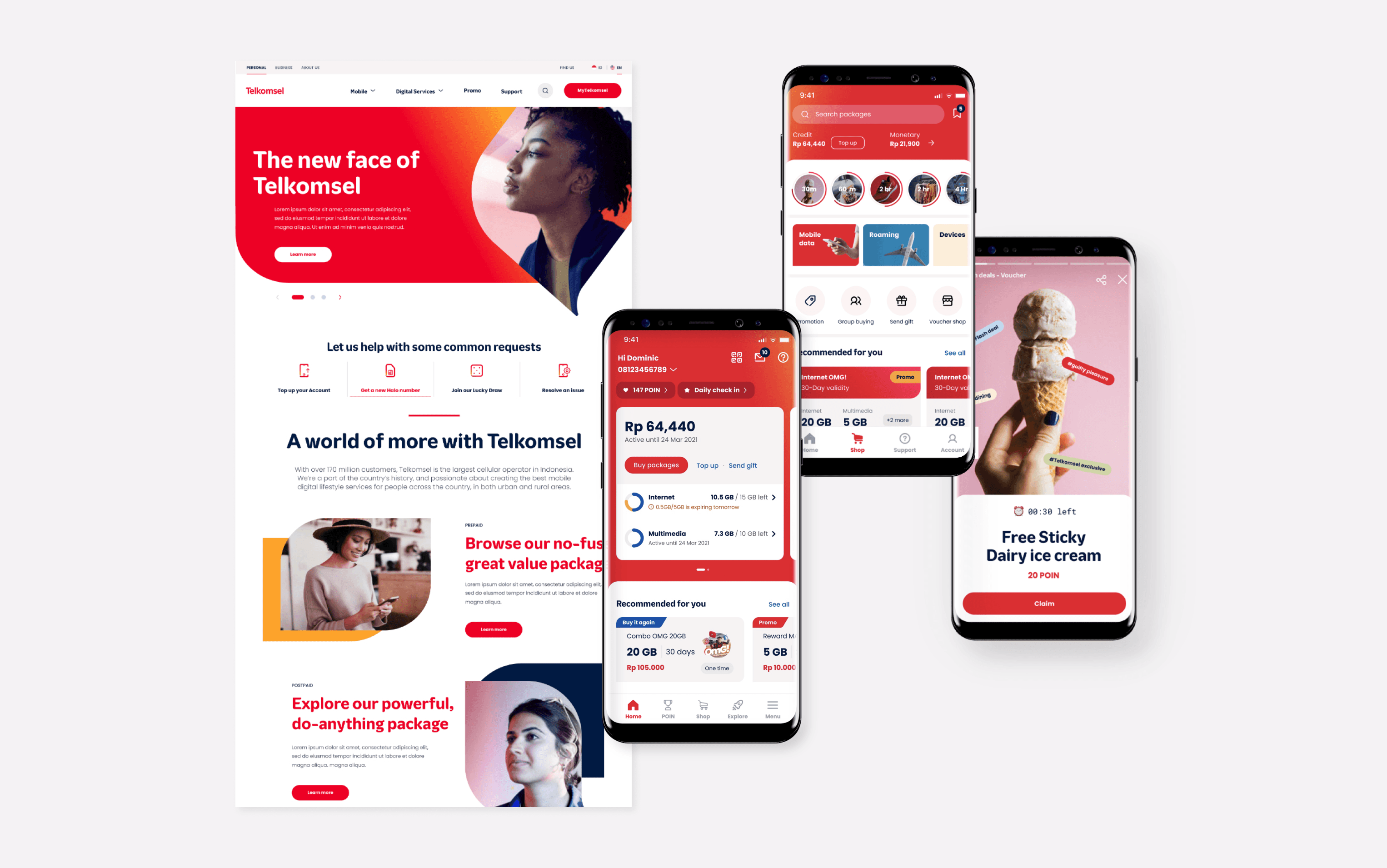
The project went live on June 18, 2021, and was honoured with the Singapore Good Design 2022 award in the ‘Experience Design’ category. Also, MyTelkomsel app received 4.7 stars from 1.2 million App Store reviewers and 4.6 stars from 10.8 million Google Play reviewers (Sep 2024).
Context
Highlight of the design challenge: the tension between users + the product team vs. business owners "Who can achieve the homepage as they wish."
Customers
"…hard to find promotions and products suitable for me."
"App is too heavy. My phone can't open it."
Many Indonesian customers use lower-powered mobile devices and slower internet connections. As a result, they often rely on SMS to check their balance rather than using an app since the current Telkomsel app is too slow and resource-heavy for most users.
It was difficult to navigate to the most relevant product due to the large number of data products with unintuitive packet names.
Telkomsel business owners
"The home page is the best real estate on our platform."
"I want my products to be surfaced on top of the Homepage."
Due to these performance issues, key metrics like acquisition, retention, and other app-related KPIs have been negatively impacted.
The stakeholders at Telkomsel have pushed to add more content and features to the app's above-the-fold area, which has further slowed it down due to its impact on their KPIs.
Generating more products is one of the critical KPI metrics for the product owners.
Telkomsel product team
"… want you to eliminate a long carpet…"
The product team is struggling to shorten the homepage due to the most business owners' desire to include more items on the Homepage (expensive real estate).
Approach
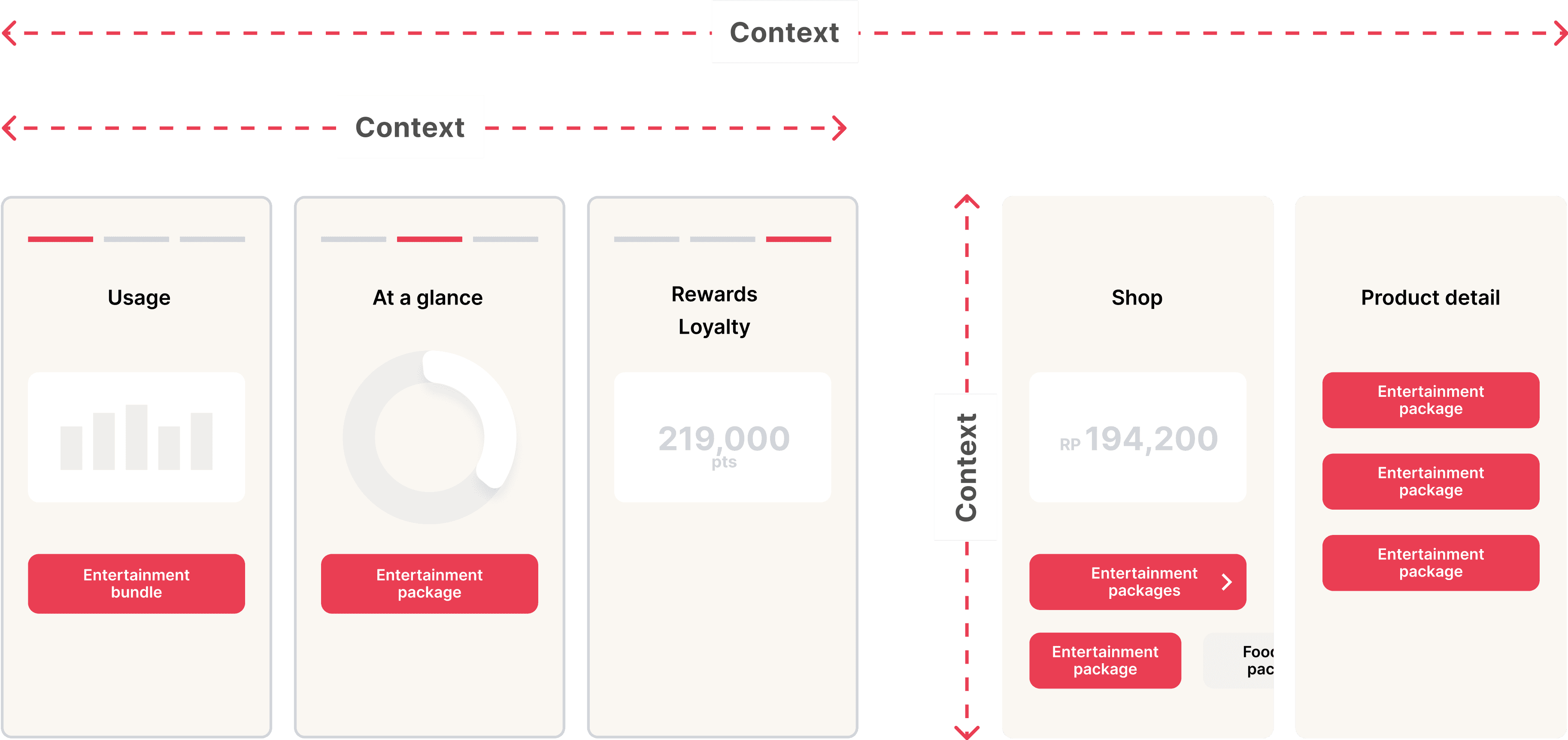
a context-based scalable homepage interaction named '3 rooms homepage'
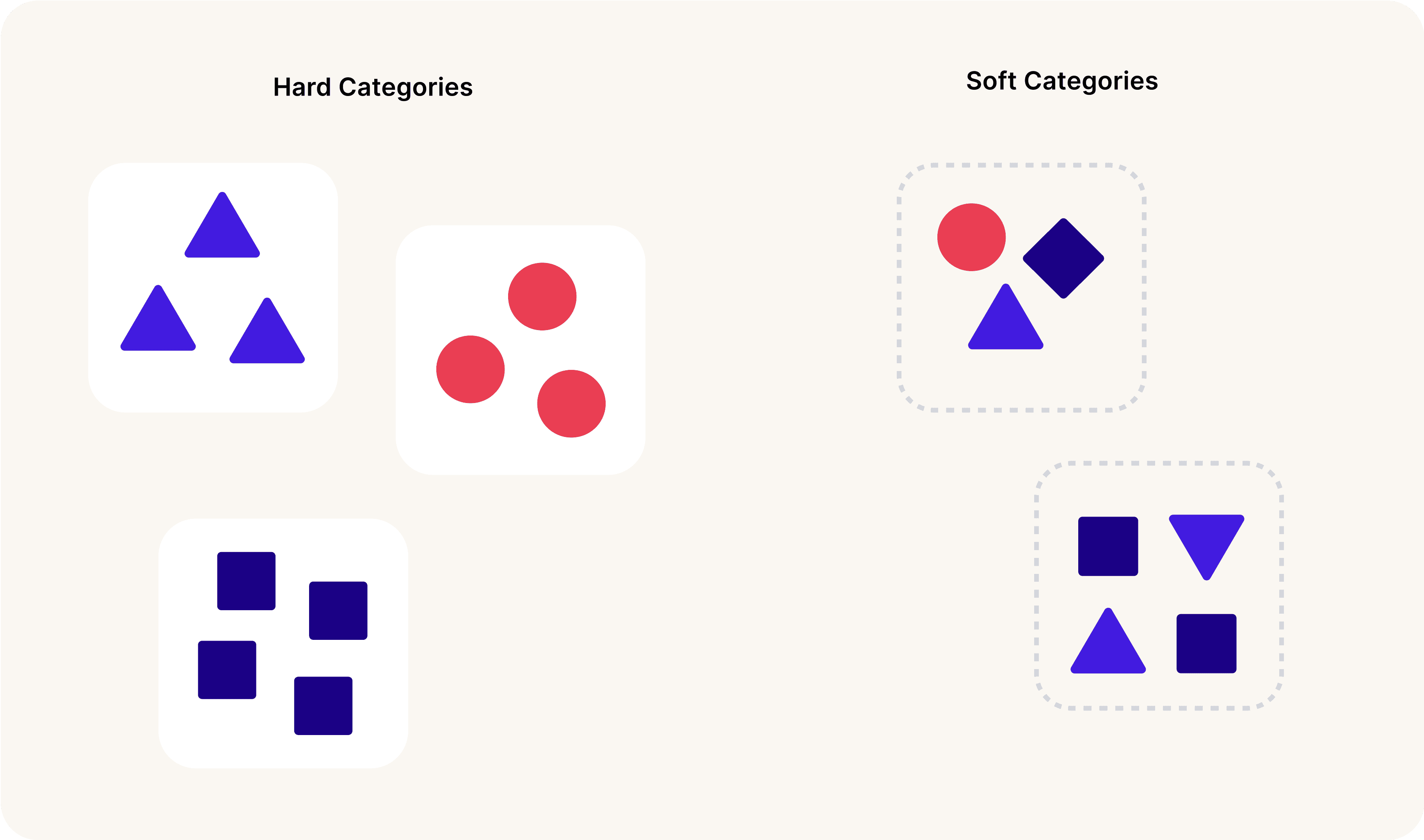
A 'soft category' interaction that focuses on user experiences rather than traditional hard categories like Travel or Video. For example, 'Night-owl Netflix viewers' offers tailored data packages for users who stream video content at night, blending multiple categories into a more personalised experience.
A brilliant basics — Information architecture
Often, we overlook the crucial and impactful nature of good information architecture for complex digital products. We list down all objects and consolidate them into intuitive categories to help users find the desired products.
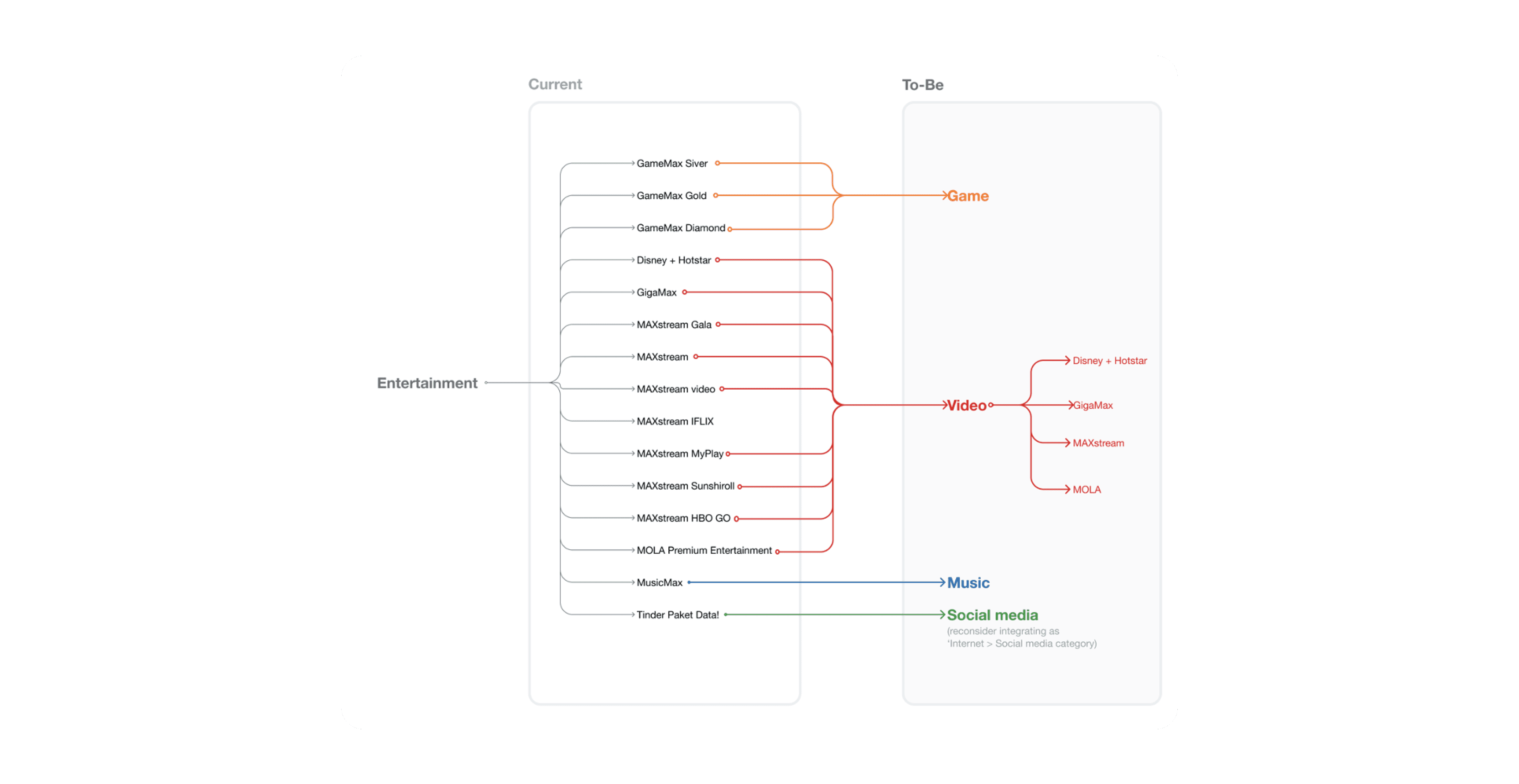
Sample visualisation of information architecture design of how to simplify the Entertainment products
Design
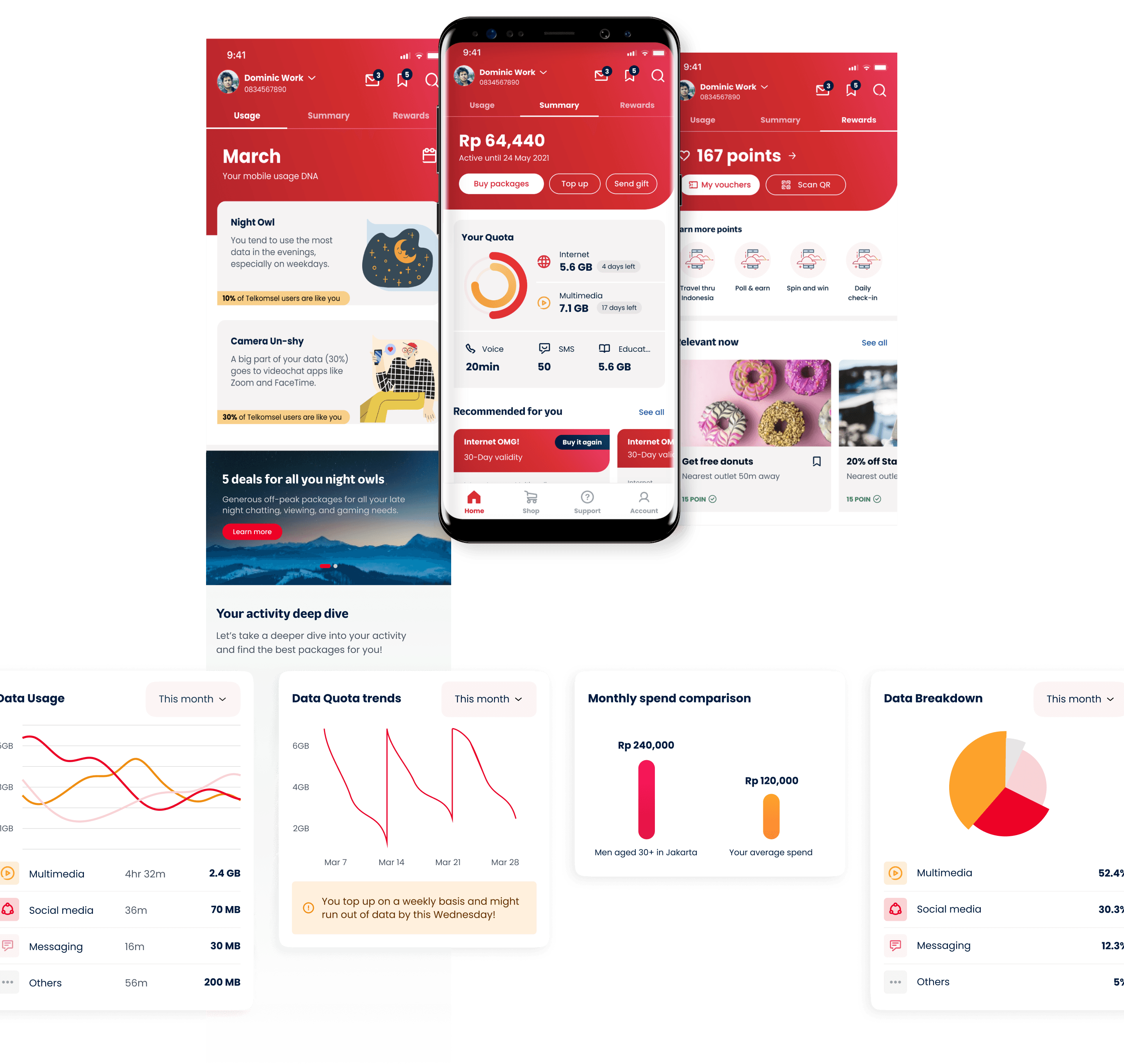
Context-based scalable homepage
The 'Summary' page (at the centre) presents the essential information, including the remaining quota and top recommended products tailored to the user's needs.
The 'Usage' page is designed to provide insights into data consumption patterns. It tells a personalized story by analyzing data usage behaviour, linking relevant packages, and offering data visualisations for deeper exploration.
The 'Rewards' page targets royalty-focused customers—a key insight from our research, which revealed that the majority of Indonesian users place high value on rewards. This page is crafted to meet their expectations, enhancing engagement and satisfaction.
Product-related screens
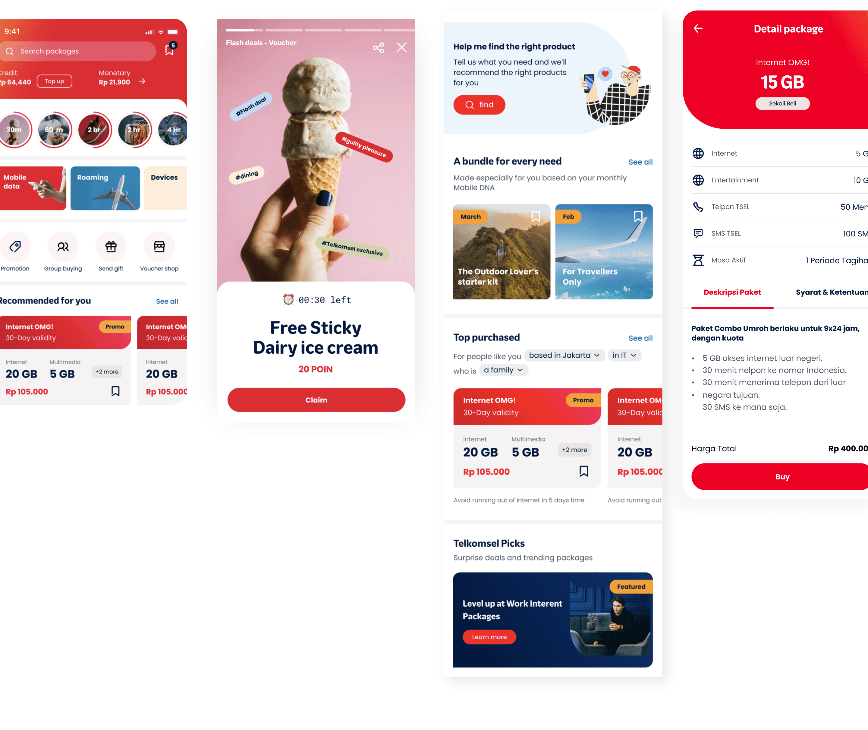
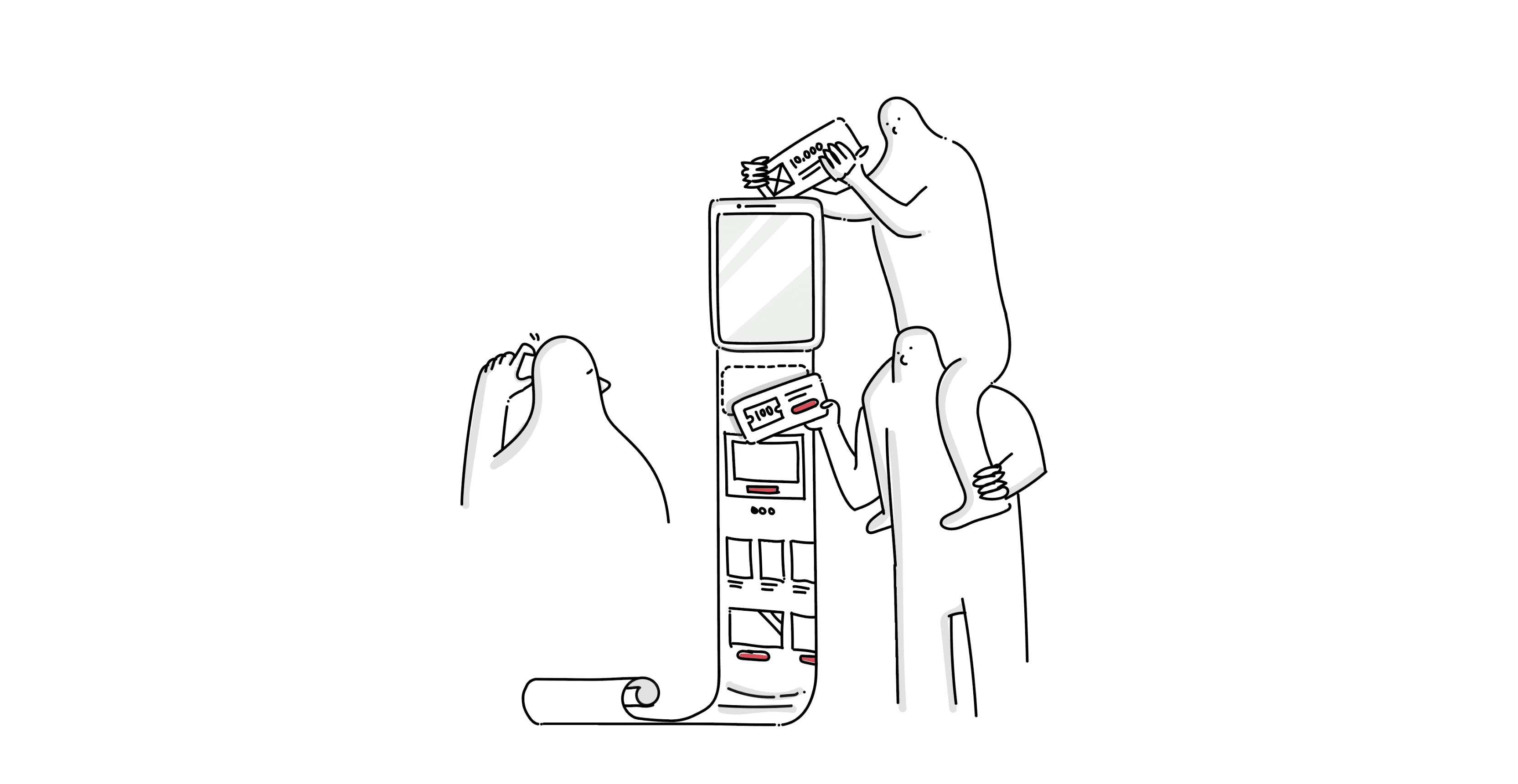
We explored various strategies to help users to find more relevant/contextual product ideas. For example, we reimagined how users discover products online by bringing elements of the offline experience into the digital world. Just like a store clerk would greet and guide customers to the most relevant products in a physical store.
Related projects.
Interaction model
Design leadership
From capability to delivery
Led design of an innovation project for LG Design Studio, including a unique banking app strategy, through co-creation and capability building with client teams. This collaboration secured a $20M investment for further organizational upskilling engagements.
Coming soon…